Building the foundation that lets hundreds of merchants ship consistent, on-brand storefronts at scale - without starting from scratch every time.
RoleSenior Product Designer
CompanySalesforce
My OwnershipFull transactional core: Cart, Checkout, Mini-Cart, Payments, and My Account
Team2 Designers, 7 PMs, 4 Engineering Teams
Overview
A re-architected storefront, built for how teams build today
Storefront NEXT is Salesforce Commerce's next-generation storefront, a ground-up re-architecture designed to deliver a modern, performance-first commerce experience for both developers and merchandisers. Not a visual refresh. A structural rethink of how a storefront template should work when the tools, the teams, and the expectations have fundamentally changed.
Two designers shaped the entire system. I owned the transactional core: Cart, Checkout, Mini-Cart, Payments, and My Account. The critical path every shopper travels before and during a purchase. To bring it to life beyond the component level, we built industry-specific templates. The first is Fashion, a ready-to-launch storefront tailored to how shoppers discover and buy apparel. Our next industry template is currently in the works.
Problem
Customers spend more time fighting the foundation than shaping the experience
The existing storefront had served Salesforce Commerce for years, but merchants were telling us it wasn't working anymore. They needed something more performant, less expensive to get started with, and easier to integrate with their existing tools. Meanwhile, every new implementation was re-inventing patterns that should have been solved once.
save as before-sfra.png
SFRA Store, the original storefront - rigid and hard to theme
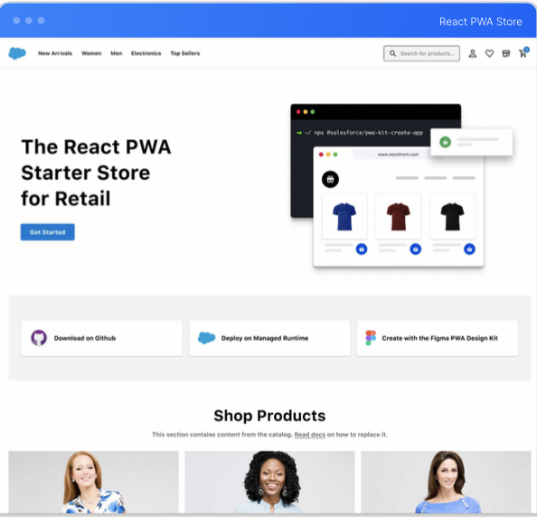
save as before-pwa.png
React PWA Store, better but still constrained by outdated tooling
🗣️Customer feedback
Branding takes weeks
Design and code drift apart
Components are duplicated across projects instead of shared
Every implementation re-invents what should be universal
Workflows aren't structured for AI
For the design team, this wasn't just a rebuild brief. It was an opening to rethink how people actually work with a storefront template, and to think seriously about how emerging tools and technologies could make that work faster and better.
How might we modernize our storefront solution using emerging technologies to help customers build world-class e-commerce sites?
For the transactional flows, the stakes were highest. A confusing checkout, a broken payment state, or a cart that doesn't reflect what the shopper expects can undo everything that came before it. We needed components built to handle real edge cases: split payments, partial cart updates, address validation, account states, without requiring custom work every time.
Process
Designing for flexibility without losing coherence
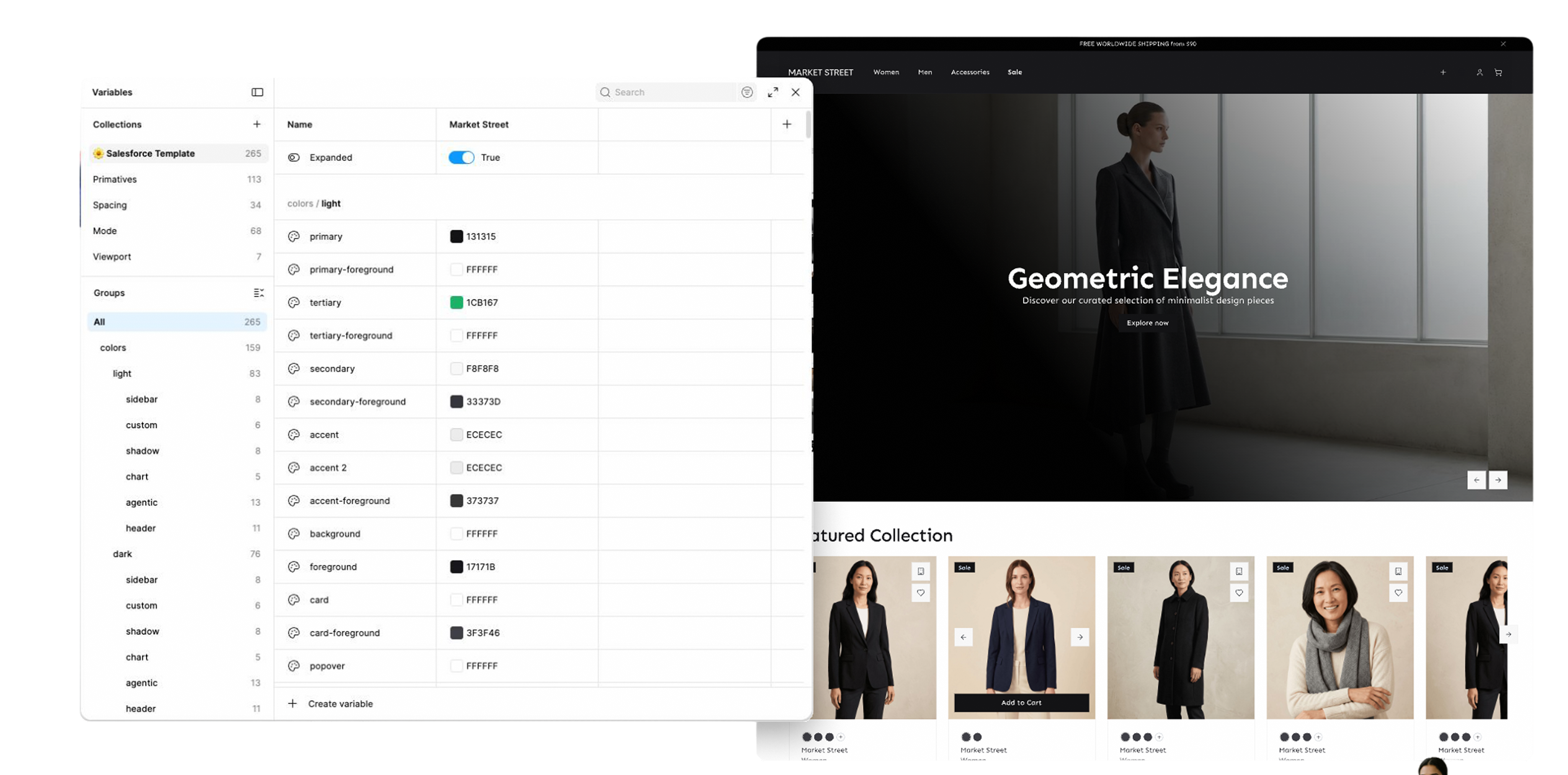
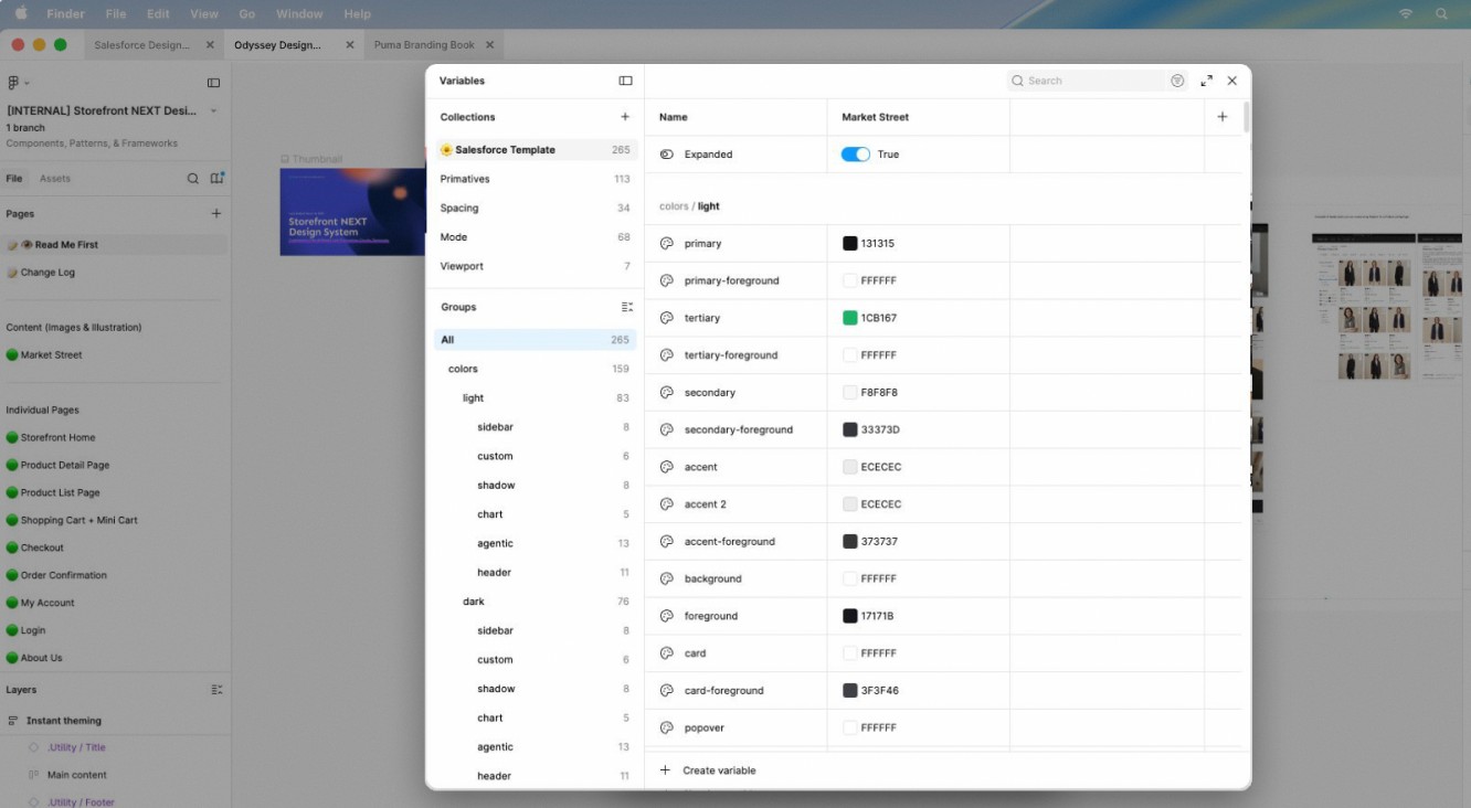
We started with tokens, the shared language between design and code. Every color, spacing value, and type style lived in a single source of truth that synced between Figma and the codebase. That parity meant anything I designed could be implemented exactly as spec'd, and any merchant could retheme it by swapping tokens rather than rewriting components.
AI-Ready by Design
Built for the way teams build today.
React 19 · Vite · TypeScript · Tailwind · shadcn
The stack wasn't chosen for familiarity. It was chosen so AI tools could actually work with it. A standardized, typed codebase means AI-assisted development is fast, predictable, and safe to ship.
For checkout and payments, I mapped every shopper state: first time shopper, returning shopper, shipping to multiple addresses, buying online and picking up in store (BOPIS), multiple payment methods, failed addresses, and so much more. The goal was that no matter what a merchant's storefront looked like, the experience of completing a purchase felt reliable and clear. I worked closely with engineering and PM to pressure-test edge cases early, so decisions were grounded in what could actually ship.
checkout or cart flow explorations
The System
A transactional system built for trust
The cart, checkout, and payments components I designed are theme-aware by default, so a merchant can map their brand identity across the entire purchase experience without touching the underlying logic.
Mini-Cart keeps shoppers anchored without pulling them out of their browse flow, surfacing just enough to confirm their action and nudge them toward checkout. Cart is the decision point, designed to give shoppers full confidence before they commit: clear item summaries, editable quantities, applied promos, and a persistent view of what they owe.
Checkout is structured around progressive disclosure, one decision at a time, with clear recovery paths when something goes wrong. Paired with 1-Click Passwordless Checkout, returning shoppers can skip the friction entirely and complete a purchase in a single tap, no password required.
final cart and mini-cart UI
checkout flow - final screens
My Account brought the same thinking to post-purchase: order history, address management, and saved payment methods designed to feel like a natural extension of the storefront rather than a bolted-on portal. The Shopper Agent work extended this further - designing the interface for Salesforce's first AI-native commerce assistant, where the conversation itself becomes part of the purchase experience.
Impact
Faster launches. Fewer one-offs.
Storefront NEXT vastly outperforms industry gold standards for Core Web Vitals, out of the box, before any merchant optimisation.
%Faster loading PDPLCP vs. industry gold standard
%Faster interactivityTBT vs. industry gold standard
%Better stabilityCLS vs. industry gold standard
Speed is revenueIndustry research (Deloitte & Google) shows a 0.1s improvement in mobile site speed can lift conversions by ~8.4% - which is exactly why building this performance in by default, before any merchant optimization, matters.
Teams using Storefront NEXT can go from brand guidelines to a production-ready storefront in hours, not weeks. The design-to-code parity we built means what ships looks exactly like what was designed. Merchants aren't asking for custom payment states anymore. The defaults are finally good enough to ship with confidence. That's the goal of any design system: make the right thing the easy thing.
Press & Recognition
The work got noticed.
Storefront Next was covered on Salesforce's official blog, published to the Figma Community by Salesforce, and celebrated by product leaders across the org at launch.